Connected to your business
Risk is priced from your real vendors, your pipeline, and your revenue at risk. Not an industry-average report you could have Googled.
Risk in dollars, not colors
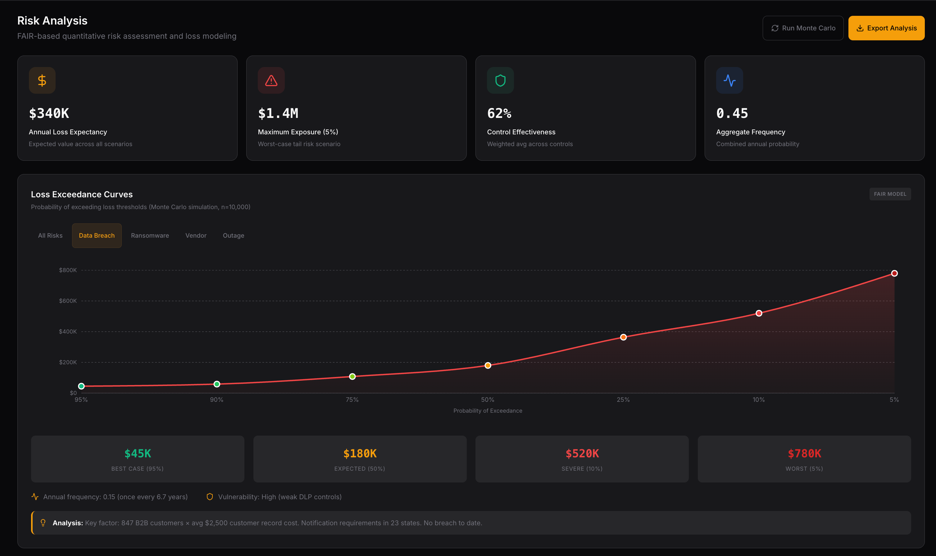
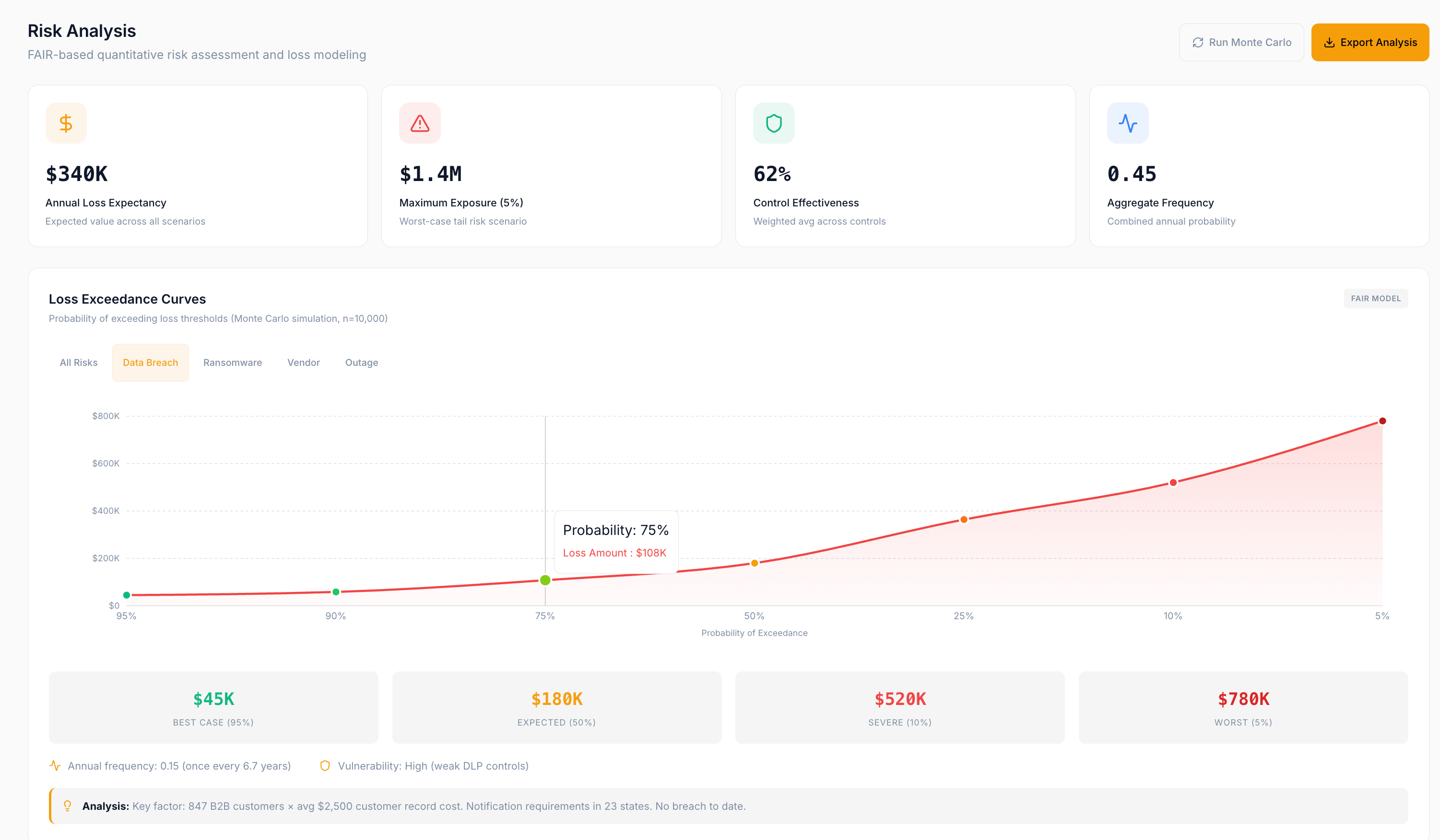
Most security reporting is generic scores and red-yellow-green dashboards that don’t mean anything to the people writing checks. The platform connects your security posture to your actual business — your vendors, your pipeline, your strategic goals — so every risk has a dollar figure and every recommendation has an ROI. That’s how you quantify the risk without hand-waving: expected annual loss, worst-case exposure, and peer percentile benchmark, all traceable to how your business actually runs.
Your CEO asks “what do we invest in next.” Your CFO asks “what is our actual exposure.” Your Security Director asks “where are the gaps and how do we close them.”
Same platform, three answers, one shared source of truth.
The shift
Three problems most security programs live with, and what changes on the platform.
View 01·The board pack·For the CEO
The Executive view ranks every recommendation by dollar impact and shows the two-quarter delta in one page. Complete SOC 2 to unlock $2.1M in stalled pipeline. Close the identity gap to reduce enterprise deal cycles by three weeks. The chart you forward straight to the audit committee, not a heat map that reads “we are doing security.”
View 02·CFO Talk Track·For the CFO
Every risk scenario ships with a CFO Talk Track: the worst-case narrative, ARR at risk, contract-exit implications, and the specific items that would land on a 90-day SEC disclosure, already translated into the language a CFO uses in front of a board. Pair it with the Continuous Indicators layer inside Allotrope and the number is not just quantified, it’s live.
View 03·Maturity by security domain·For the Security Director
Maturity scored across every security domain your program covers, cross-mapped to every framework you run — the named standards and any custom framework you define. Test of Design + Test of Effectiveness, benchmarked against peers, with a remediation roadmap sequenced by risk-buy-down. When leadership asks whether security spend is working, the chart is right there. When you ask for the next tranche of budget, the risk-buy-down math justifies it.
Worked example
Slack from the CFO: “Audit committee tomorrow morning wants to hear about our cyber risk exposure. Something they can point to. Bring a number.”
You send the CFO a three-page brief with a defensible portfolio number, a loss exceedance curve, the coverage gap in dollars, and the top three recommended investments already scored. The audit committee walks away with an answer, not a follow-up question.
Why this is different
Plenty of tools do one of these. Nothing else does all four on one platform.
Risk is priced from your real vendors, your pipeline, and your revenue at risk. Not an industry-average report you could have Googled.
Every recommendation carries a business-tied dollar value. Boards understand it. Insurers underwrite against it. Spend defends itself.
Re-derived continuously from your live posture. The number you see is the one that is true today, not the one from last year’s consulting engagement.
Every policy, control, and vendor assessment feeds back into the model. Your score improves. Your exposure drops. You can prove both.
Common questions
For PE deal teams and M&A buyers
The same FAIR-aligned methodology, productized for cyber due diligence at deal speed.
See Quantitative Cyber DiligenceSee your risk in dollars, benchmarked against peers, with a clear path forward.